Squarespace Architecture | Designing for Cognitive Diversity
A structural approach to designing layered digital systems for diverse ways of thinking.


INSIDE THIS FRAMEWORK
Sequential Models and Cognitive Variation — how dominant web structures reflect particular processing assumptions.
When Structure Narrows — where simplification shifts into truncation.
Misalignment as Structural, Not Personal — recognising architectural containment issues rather than self-doubt.
Hierarchy Without Narrowness — expressing order without compression.
Designing Layered Navigation — distributing structure to accommodate multiple entry points.
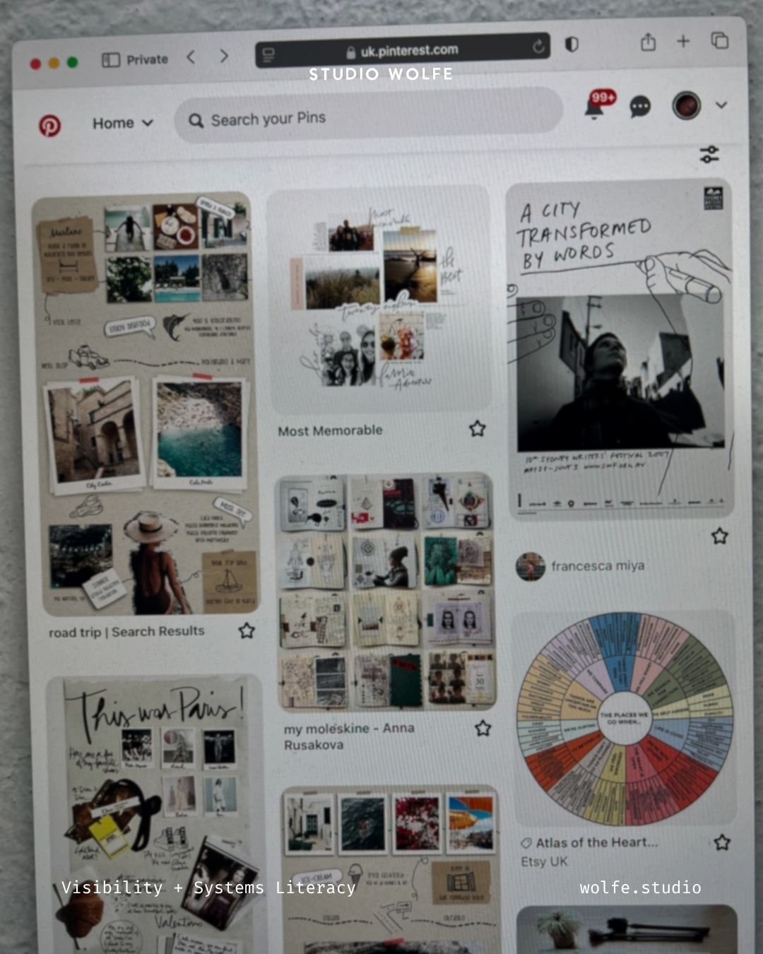
Ecosystem Thinking Over Page Thinking — treating pages as relational nodes rather than isolated units.
Coherence Without Reduction — preserving dimensionality while maintaining clarity.
Architectural Application — translating cognitive diversity into structural decisions.
Digital architecture reflects the dominant logic of its time.
For decades, websites have largely followed sequential pathways — homepage, about, services, contact — organised as a progressive narrowing of attention. This structure is efficient. It supports clarity. It scales predictably across industries and audiences.
Sequential cognition operates comfortably and effectively within this model.
Yet not all thinking moves through information in sequence. Some perceive systems as integrated wholes before they articulate parts. Some synthesise across domains simultaneously. Others map relationships, patterns, or spatial connections before defining hierarchy. These variations are not anomalies; they are legitimate cognitive orientations.
As website building tools have become more accessible, this diversity of thinking has become more visible in design itself. Environments are emerging that feel layered, exploratory, and interconnected — not because hierarchy has disappeared, but because it is being interpreted more expansively.
The question, then, is not whether structure should exist. It is whether structure can hold multiple ways of thinking without narrowing them in the process.
Architecture can remain coherent while accommodating variation. Clarity does not require compression.
When Structure Narrows
Most website templates are designed to reduce friction. They prioritise clear top-level navigation, limited menu options, singular positioning statements, and funnel-based pathways. For many businesses, this model works well. It provides speed and legibility.
Reduction, however, can become over-correction.
When complex work is forced into narrow containers, language is often simplified beyond accuracy and navigation begins to conceal relational depth. What appears streamlined at the surface may conceal internal fragmentation.
The result is not clarity but truncation.
A creative practice may hold layered offerings, intersecting domains, or evolving ideas. If architecture requires these to collapse into a single headline or strictly linear pathway, coherence weakens internally even when the interface appears clean externally.
The site looks simple. The system feels misaligned.
This tension is rarely technical. It is architectural.
When Misalignment Is Structural, Not Personal
When architecture narrows too aggressively, the people stewarding the work often experience tension before users do. The interface appears clear, the messaging simplified, the pathway efficient. Internally, however, something feels truncated.
Ideas that connect in practice are separated in structure; intersecting domains are presented as isolated, and language is reduced to fit a headline rather than reflect the work accurately.
This is not indecision. It is structural misfit — a mismatch between cognitive dimensionality and architectural expression.
When multidimensional thinking is compressed into overly narrow digital models, coherence weakens — not because the work lacks focus, but because the structure cannot yet hold its breadth.
Architecture, in this context, becomes a containment question: can the system reflect the way the work actually connects? If not, optimisation will amplify misalignment rather than resolve it.
When it does, something subtle but significant becomes possible: the site feels aligned before it feels optimised. That alignment is structural, not emotional.
When misalignment is structural, the remedy is structural.
This may involve re-mapping domains before refining headlines, allowing related ideas to live in visible proximity rather than forcing separation, designing navigation around conceptual clusters instead of marketing stages, and expanding page architecture so depth can unfold progressively rather than compressing it into a single claim.
Alignment rarely emerges from better wording alone. It emerges when structure mirrors how the work actually connects.
Hierarchy Without Narrowness
Hierarchy is necessary. Users require orientation, search engines require structure, and accessibility requires predictable pathways.
The question is not whether hierarchy exists, but how it is expressed.
A narrow hierarchy enforces:
One entry point
One dominant pathway
One central framing
A layered hierarchy allows:
Multiple legitimate entry points
Cross-linked conceptual pathways
Depth that can be explored without disorientation
For example, a layered navigation system might group offers by domain or theme rather than by sales stage, allowing users to enter according to conceptual interest rather than predetermined sequence. Instead of directing every visitor through the same narrowing path, the structure reflects how ideas relate within the work itself.
The difference is subtle. One organises dimensionality through sequence. The other situates sequence within a broader field.
Designing Layered Navigation
Layered architecture does not remove structure; it redistributes it across the system so that hierarchy remains legible while dimensionality is preserved. Rather than concentrating navigation into a single narrowing pathway, structure is expressed through visible relationships between domains.
In practice, this may include:
A homepage that orients rather than funnels.
Service pages that interlink conceptually rather than isolate vertically.
Resource sections organised by theme rather than chronology.
Navigation that reflects domains of thought rather than marketing stages.
Clear sub-structures that allow depth without forcing progression.
These decisions do not increase confusion. They increase legitimacy for varied cognitive approaches.
A sequential user can still move step by step. An associative user can move laterally. Both remain oriented.
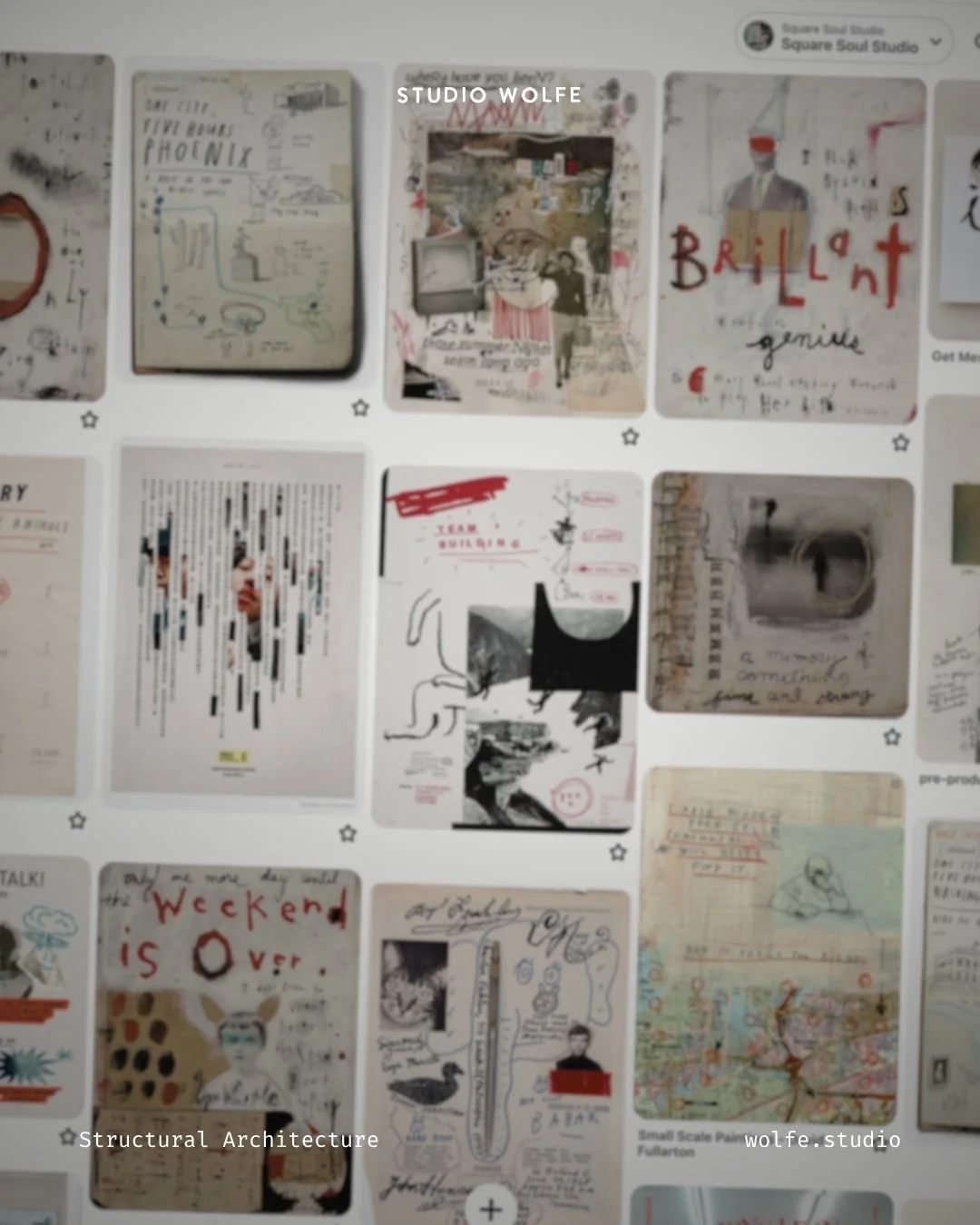
Ecosystem Thinking Over Page Thinking
Traditional web design often treats pages as isolated conversion units, each responsible for directing attention toward a specific outcome. Authority is concentrated within individual pages rather than distributed across the system.
Ecosystem architecture operates differently. Pages function as relational nodes within a wider structure. Concepts interlink intentionally. Depth accumulates rather than fragments. Entry points are plural rather than singular.
In this model, coherence emerges from connection rather than containment. Movement through the system is not dictated by a single narrowing path but supported through visible relationships between domains.
Architecture becomes a field rather than a corridor.
This is where mapping digital ecosystems becomes foundational, because pages must be understood as relational nodes before they are designed as isolated layouts.
Coherence Without Reduction
The impulse behind narrow structures is often the desire to prevent confusion. Designers reduce options to avoid overwhelming users, assuming that dimensionality itself creates disorientation.
In practice, overwhelm rarely arises from depth. It arises from unclear orientation.
Clarity and dimensionality are not opposites. Depth becomes navigable when hierarchy is legible, pathways are intentional, and relationships between ideas are made visible rather than implied. Precision in language supports this further; inflation and ambiguity erode it.
When structure maps how ideas connect, dimensionality no longer feels excessive. It becomes coherent.
Architecture, at its core, is the act of mapping.
Designing for Yourself Without Designing Only for Yourself
Systemic thinkers often attempt to simplify their work beyond recognition in order to “fit” established digital norms. This can create internal misalignment before launch.
Designing for cognitive diversity does not mean abandoning user experience. It means widening structural assumptions so that more than one way of thinking can move comfortably through the environment.
The site remains legible.
The work remains intact.
At this level, the structural role of a creative manifesto can help clarify which principles need to remain intact as the system becomes more accessible.
That is the balance.

Architectural Application
Designing for cognitive diversity does not require abandoning hierarchy. It requires widening how hierarchy is expressed so that structure reflects relational depth rather than suppressing it.
The following principles translate this into architectural decisions.
01. ORIENT BEFORE YOU FUNNEL
Orientation establishes context before directing action. When users understand the conceptual landscape of a site, sequence becomes a choice rather than an imposition.
A homepage can function as an orientation field rather than a narrowing device.
Instead of directing immediately toward a single outcome, it can:
Map domains of thought
Clarify relational pathways
Signal depth before sequence
Sequence can still exist — but it follows orientation.
02. DESIGN MULTIPLE LEGITIMATE ENTRY POINTS
Not all users begin at the homepage, and not all users approach information in the same order. Architecture that assumes a single entry pathway risks narrowing legitimate movement.
Structure becomes more resilient when multiple access points are intentional rather than accidental.
Architecture that assumes plural entry points:
Ensures each page contains sufficient context
Cross-links laterally, not only upward
Avoids isolating conceptual threads
A system strengthens when movement is multidirectional.
03. MAP RELATIONSHIPS EXPLICITLY
When ideas intersect in practice, the architecture should make those relationships visible rather than leaving them implicit. Relational clarity reduces cognitive friction more effectively than reduction does.
Mapping is not decorative. It is structural articulation.
This can be expressed through:
Thematic navigation clusters
Contextual internal linking
Clear secondary pathways
Visible structural hierarchies
Dimensionality becomes navigable when relationships are mapped rather than implied.
04. PRESERVE DEPTH WITHOUT OBSCURITY
Complex work does not require complexity of interface. Depth becomes overwhelming only when its structure is hidden or ambiguous.
Legibility allows dimensionality to unfold without collapsing into noise.
Clarity emerges from:
Legible headings
Logical grouping
Progressive disclosure
Intentional content layering
Depth can exist beneath surface simplicity.
05. BUILD SYSTEMS, NOT CORRIDORS
A corridor directs movement along a single prescribed path. A system supports movement across interconnected domains without disorientation.
When architecture functions as a system, users are not forced into uniform behaviour; they are supported in navigating according to preference.
When pages function as nodes within a coherent ecosystem, users move according to their cognitive preference without losing orientation.
Architecture becomes adaptive without becoming chaotic.
Architectural Synthesis
Designing for cognitive diversity is not a rejection of established structures. It is a recognition that thinking itself is varied.
Sequential cognition remains valid. Relational cognition remains valid. Pattern-driven cognition remains valid. Digital architecture can accommodate all three when hierarchy is expressed with intention rather than constraint.
Clarity does not require flattening. Hierarchy does not require narrowing. A coherent system can hold multiplicity without losing legibility.
This creates the conditions for the threshold of creative emergence, where complexity can begin to move into form without being forced into premature simplicity.
STUDIO WOLFE JOURNAL
This article sits within the Squarespace Architecture series — part of Studio Wolfe’s structural framework for designing coherent digital environments. Explore related posts within the Squarespace Architecture series or enquire about bespoke ecosystem support.